‘Simple,’ ‘Easy-to-use,’ ‘Get started within minutes’…
These words are used for every website builder. No website will ever explicitly state that it isn’t fit for beginners.
But more often than not, the website builder you select is simple and easy for those who have coding and design know-how. Or at least some website building experience. And you end up spending hours trying to figure out where to start.
So, how do you find a builder that is actually great for beginners?
Well, we made complete newcomers take the most popular website builders for a test drive. Based on the feedback gathered and our expert analysis of the website builder’s functionality, we have the top 10 best website builders for beginners.
If you have no website building experience, you can still get online with a stellar website in 2021 with these top website builders:
Wix
You probably know about Wix thanks to their big-budget marketing campaigns starring Gal Gadot, Heidi Klum, and several other big names. And with over 150 million websites built on Wix, their marketing campaigns are working too. But that’s not just because of marketing, but also because the builder is actually one of the best out there.
Price: Free plan available. The lowest plan ‘Combo’ comes at $13/month (paid annually).
Features that make work easier for beginners –
Drag-and-drop builder to help you create a website without having to add even a word of code.
Plenty of free templates (over 100) to make sure you can get the design that suits your needs and helps you stand out from the crowd.
Hosting and domain name are offered by Wix (both free and paid variants available). This frees you from the stress of handling the backend. Also, you get the safety and backup features.
A loaded app market with all the functional attachments you need to take your website from drab to fab.
Mobile optimized themes and templates that make it easier for you to reach a wider audience across devices. You don’t have to spend time carrying out mobile optimization on each page.
Weebly
Most people won’t say their website building experience was fun. Easy, yes. But fun isn’t probably the right word. But that isn’t true in the case of Weebly users. Your website building experience with Weebly will be effortless as well as fun. You’ll enjoy moving around the objects and seeing your ideas materialize in front of your eyes.
Price: Free plan available. The lowest plan, “Personal,” comes at $6/month (paid annually).
Features that make work easier for beginners –
60 quality themes that aren’t old and recycled but fresh and new. Arranged in categories to make finding the right option easier, good quality, and uniqueness is their USP.
All themes are mobile-optimized, which means your website will load perfectly on smaller screens and mobile devices too.
350 plus apps are available in the App Center and that allows you to add the required functionality to your site with ease.
Build-in email marketing tool called Weebly Promote. This is a handy feature for those who would like to reach everyone on their mailing list without using an external service.
Robust eCommerce functionalities that aren’t easy to set up. But Weebly makes it easier with a straightforward, intuitive process.
SITE123
The experience that you have working with SITE123 does justice to the name. Creating a website for basic use is as simple as 1, 2, and 3.
Price: Free plan available. The lowest plan, “Premium,” costs $5.80/month (paid annually).
Features that make work easier for beginners –
180 mobile-responsive templates that come with some cool customization options. Making your SITE123 website truly your own is as easy as it gets.
Helpful tips, tutorials, and the guided tour make the process of creating your website a breeze. Other than the user-friendly interface, you also have access to 24/7 live chat support, should you need help.
All essential eCommerce features like multiple payment forms, email marketing list, wishlist creation, and unlimited orders are available. Also, SITE123 does not charge any sales commission.
You can build your website using one of the 21 languages available. Also, your website can be displayed in 5 languages (out of over 100 options available). A truly local experience.
Editing options are easy. And SEO functionalities are available either in the form of apps from the App center or third-party integrations.
Squarespace
Squarespace is the website builder for those who have a design focus. If you are looking for a website that has drop-dead beautiful designs, Squarespace is the way to go. While it is beginner-friendly for the most part, you do need a little patience while handling the tech aspect. But it won’t be tough if you take a couple of minutes to understand your way around.
Price: No free plan. The lowest plan, “Personal,” costs $12/month (paid annually).
Features that make work easier for beginners –
60 stunning mobile-optimized templates. These templates are perfect both from the perspective of beauty and features.
Beginners don’t need to worry about accidentally deleting a post or the pages as Squarespace lets you restore deleted posts and pages for up to 30 days.
If you know the basics of coding, you can make use of it. If not, you can still use the editor to create an equally stellar website. Also, you can use the Squarespace app and edit your site from your mobile phone.
Tons of built-in blogging features that make setting up and running a blog very easy. Also, a lot of images are available, and social media integration is possible. You can also add contributors to your blog.
Wide range of eCommerce functionalities that make it effortless to set up a designer storefront and manage inventory.
WordPress
WordPress powers more than a third of the web. And that is proof enough of how easy to use and feature-loaded it is. WordPress.org is a self-hosted platform. This gives you the liberty to choose your hosting. But it also gives you unprecedented ease of use.
Price: Completely free, forever.
Features that make work easier for beginners –
Multiple editor options to choose from. Whether you are looking for a drag and drop visual editor or a What You See Is What You Get (WYSIWYG) editor, WordPress has the right option for you. You can use the editor that you feel the most comfortable with.
53,000+ WordPress templates are available in the WordPress directory itself. You can also find more themes on Themeforest, Themify, and more. These options are both free and paid. And you are really spoilt for choices.
The WordPress plugin directory has a plugin for any and every feature, form, and functionality addition that you can think of. There is nothing that you need to do yourself. You can find a (free or paid) plugin to do that.
WordPress is SEO-friendly out-of-the-box. You can do nothing and still rank. But for competitive niches, you can also use plenty of optimized themes and SEO plugins.
Managing WordPress is a breeze. Mostly because the one unified dashboard has everything that you need. And even for your security concerns, you can use one of the multiple plugins available.
WebNode
WebNode is among the fastest-growing free website builders in the market. With over 22 million active users, it is a great point-and-click website builder that is great for beginners.
Price: Free plan available. The lowest plan, “Limited,” comes at $3.95/month.
Features that make work easier for beginners –
An easy-to-use drag-and-drop online editor that makes building a website as easy as possible. You just have to pick up the elements, drag them where you want to see them, and drop them right there.
No ads ever. Even if you are on the free plan, you don’t have to deal with WebNode ads on your site. This lets users select plans without pressure. You don’t need to jump to the higher plans right away to get rid of ads. Also, it lets you use custom domains as well.
Hundreds of pre-designed, beautiful, and responsive templates are available. Also, when you select a theme, you can select the pages that you want on your site. Home, About, Contact, News, Products, FAQs, and Our Team are some of the pages that are created automatically. You can edit these pages with the drag-and-drop editor and get your pages ready in minutes.
You get a lot of in-built SEO features. You can edit the page title, URL, and metadata. There is an option to edit the Alt tags for images as well. Those who aren’t experts at SEO can use these in-built features to get a higher search engine ranking. Plus, you can create up to 20 versions of your website in different languages.
WebNode comes with email support. But if you are just starting and want to learn things from the basics, you can check out their community forum. There is also an FAQs page on the website that will solve all the doubts that beginners are likely to have.
Strikingly
If you want to create a single-page website where your visitors just scroll through different sections, Strikingly is the best option. It is a quick and easy-to-use website builder that lets you create simple to use websites.
Price: Free plan available. The lowest plan costs $8/month (paid annually)
Features that make work easier for beginners –
Strikingly offers dozens of templates to build your website. Also, these templates are customizable, and so you can make sure your website looks unique. With the paid plans, you can also edit the header and footer as per your need.
A simple drag-and-drop editor makes customizations easy and quick. You can also get an SEO checklist to make sure you don’t miss anything. Plus, there is an option to add animations and scroll effects.
Strikingly can suggest color themes based on your logo. This is especially helpful for the users who aren’t very good at the design aspects. You can take the suggestions and create a website that looks in sync with your brand logo.
Mobile optimized themes are available. You can also make adjustments for a mobile display to make sure there are no discrepancies. iOS and iPad apps are also available. You can use this app for order management, replying to customer responses on the contact form, and to edit the website.
The Integration section has a lot of options to add more functionality. From email marketing to social media and payment partners, you can add a wide range of features. Without having to add codes or do complex settings.
SimpleSite
SimpleSite’s name says all that it has to offer. Simple sites. If you haven’t built a website before and have never taken a look at a website builder’s backend, this one is perfect for you.
Price: Free plan is available. The lowest plan, “Pro,” costs $15.49.
Features that make work easier for beginners –
Starting with SimpleSite is, well, too simple. You just have to choose a color theme. Then add images and titles. Go on to add a domain name and create a login setup. With that, your website will be ready to go live. You can then return to the fine-tune editing later. Plus, you also get five professional email ids with the SimpleSite account.
A quick editor. With SimpleSite, you don’t have to pull your hair trying to edit an element. The no-fuss editor is a quick way to make your site look like you want it to.
For those who are baffled by choices, SimpleSite selects the templates for you. Based on the type of website you want to create, you get a suitable template. But that doesn’t mean you have no choice. You can choose the Business option while selecting templates and browse through the available options.
The free plan that lets you see up to 5 products. If you just want to sell a few products without opening a full-blown eCommerce store, you can do with the SimpleSite free plan. A great way for beginners to test waters before taking the plunge.
Mobile optimized themes are given. Plus, you can also edit your website from your mobile’s browser. No need to download yet another app.
Jimdo
More than 20 million websites have been created with Jimdo. And that number is set to rise with the introduction of Jimdo’s AI-based editor. The AI-powered Dolphin editor takes the driver’s seat and makes website building a cakewalk for beginners.
Price: Free plan available. The lowest plan costs $10/month (paid annually).
Features that make work easier for beginners –
Jimdo Creator, the basic website builder, has a drag-and-drop editor that can be used to add style, sophistication, and uniqueness to your website with ease. The Dolphin editor goes a step forward by creating the website for you. You just have to answer a few questions and then sit back and relax. Once the website is built, you can fine-tune the site to make it fit your needs.
Jimdo has a modern arsenal of templates and themes. You can edit the style and text and add images. All the templates are mobile-optimized by default. You can also see the mobile preview during site-building.
Jimdo’s interface can be accessed in one of the eight available languages. The editor lets you add text in any language of your choice. And there is an option to create multilingual websites without much hassle or coding.
Widgets can be added to make sure your site looks fine and has the required functionality. The Gallery widget and social media widgets are especially useful for adding advanced features with ease.
Jimdo also comes with a form builder that lets you create effective contact forms right then and there. Also, you get all the SEO and eCommerce functionalities that you’d need for a beginner-level website.
IM Creator
IM Creator’s website builder IM XPRS is a decent website builder for personal and business use. You get eCommerce functionality with all the plans, and it is designed with ease of use in mind.
Price: Free plan available. The lowest plan, “Premium,” costs $9.95/month.
Features that make work easier for beginners –
Plenty of responsive and customizable templates arranged in 14 categories. Also, IM Creator doesn’t stop at its promise of simplicity for beginners. When you choose a template, you get the option to watch a YouTube video. The video details how to edit the template. If you are confident, you can skip the video and start editing right away.
The eCommerce functionality and storage upgrade options are available without having to pay too much. You also get an array of feature enhancement additions. These include checkout management, management console, and analytics.
If you want a multilingual website but aren’t adept at using plugins and adding code, IM Creator feels Godsent. You can create multiple versions of your website in different languages. Available at no additional cost.
IM XPRS mobile app lets you stay in control of your website even when on the go. You can edit all aspects of your site from the app itself.
The IM Creator website has two self-help sections for beginners. You can check out the FAQs and How-To section to get details about how things work. If you still have doubts, you can use the online ticketing system to contact support.
Now that you know what are the best website builders, it is time to select the most suitable option from the list and get started.
From this list of website builders for small business, you can choose the one that you feel the most comfortable with and create your online presence with ease.
The page speed series of blog posts was geared towards desktops versions of websites and not mobile ones. This post will outline a few ways to improve the page speed of the responsive version of your website.
Before I list those reasons, test your responsive websites load speed. I have had some issues with that site but WebPageTest is also a great resource. Be sure to select an option beside “Test Location” that is either “Android Devices – Dulles, VA” or “Apple Devices – Dulles, VA” for mobile page speed tests.
How To Improve Mobile Page Speed
As online shopping and browsing becomes more and more popular, people use just about every device to participate, often including their cell phones. In our fast paced world, online browsers are impatient and may not use your website if it does not perform quickly, especially on their mobile phone. If you run a business or organization that experiences peak user times or “busy seasons”, having a fast mobile web page is even more critical in these times when more people will be using the page.
Experts say that three seconds is the maximum time that someone expects to wait for a mobile web page. Anything over that time may cause your clients to open competitor sites, spend less time on your page, and have a more negative image of your brand. So, how do you get that mobile page speed below three seconds and keep it there? Here are seven tips:
Look At Server Response Time
The server is a key element in mobile page speed, and the longer it waits to respond to requests from the browser, the longer your page viewer will wait to see the content on your page. The time your server takes to respond is called the “waiting time” or “time to first byte”, and experts recommend this to be no longer than 200 milliseconds after a request is made. The best ways to speed up this time are to improve your web server software or configuration (through coding), enhance CPU and memory resources through improving the web hosting service, or reduce the resources that your web pages use.
Avoid Redirects!
We have all experienced redirects. These are the automatic instructions that move a web page viewer to another location without them having to click anything. The most common type of redirect, a 301, moves visitors from an outdated webpage to a newly designed page. Redirects take up time, so if you do not need to use them, remove them from your web pages. Often redirects are even slower on mobile networks as they are less reliable than a desktop computer network connection. The best way to start is by using tools such as a redirect mapper to see how many redirects your web page contains.
Measure Round-Trip Times
The round trip time of data is the amount of time it takes to be both transmitted from your device to the target destination and returned back to your device. While this interval depends on many factors such as the connection source, physical distance, traffic amount, etc, it is important to regularly measure the round trip time in order to get a clear sense of average times for your page. The longer the round trip time is, again the longer your page viewer will have to wait. One of the best ways to reduce this time is to combine scripts in order to avoid repeated trips.
Load Upper Half Content First
On a mobile device, it makes sense to load the content at the top of the page first, as this is what the viewer will see first. If you code your pages so the server sends data to show the upper content first, your lower content will have slightly more time to load as the viewer browses the already loaded upper half. This gives the perception that the web page has fully loaded faster even if some of the lower content has not appeared yet.
Place JavaScript At The Bottom Of HTML Files
JavaScript is an important aspect of a web page for interactivity purposes, but it can be a big problem for load times as it does not allow parallel downloads. When this content is loaded, other downloads will not happen. To make your main page content load slightly faster, it is a good idea to put the JavaScript scripts at the bottom of the page. Another way to slightly improve speed is putting the Cascading Style Sheets at the top of the programming file. These sheets show how elements will be displayed, so it gives the appearance that the webpage is actually loading faster as the layout will be loaded first.
Optimize CSS And JS
The more data on your page, the longer the page will take to load. This is why it is so important to optimize and minimize everything on your page, but most of all Cascading Style Sheets and JavaScript files. This includes getting rid of redundant or irrelevant data that has no effect on your page function, but will improve the speed.
Compress Files
This tip will both increase and decrease load time. When data is compressed, it must be decompressed in order to be displayed. This means that the data will transmit faster, but the extra decompression step may take up more time. The trade off here is usually worth it, but this is something to keep in mind as it reduces page weight which is especially important for mobile pages.
Try out the 7 tips above to see your mobile page speeds go from over three seconds to under in the blink of an eye! If you need additional help optimizing your web pages, contact us today.
A header is the first person a user sees when they access your website. A well-created header lets your consumer know they have arrived at the right place, whether or not they are already a follower of your brand. It needs to be recognizable and easy to understand. This feature is a valuable piece of real estate that can help sell your rand if used wisely.
One form of header is known as the sticky header. It works just as it sounds – the header “sticks” to the top of a web browser as the user scrolls down the page. One of the primary motivators for this design choice can be navigation. On a site with a sticky header, the visitor can easily access another page on the website or basic information without having to scroll back up.
But just like any design decision – the user experience has to come first. And while in some cases, sticky headers can be an aid, they can also go to the other extreme and ultimately hinder the UX. If you are a UX designer, you may want to read these stats about a career in UX design. Here are some tips to avoid disaster while using sticky headers:
Avoid Large Headers
While you want the header to catch the user’s eye and be easy to read, you want to avoid making the user experience claustrophobic. Since a sticky header is going to always be visible as the user reads your main content, if it is too large the visitor will be constantly scrolling. After a while this is going to feel tiring. You want the consumer to be able to quickly get the information they need about a brand to make a decision, not spend hours trying to get through all your content because a giant box leaves the reading space small.
We recently received an email from Social Media Ninjas about how our sticky header could be reduced in size. Here’s what it looked like before:
And here’s that same page with our slimmer sticky header:
We gained about 15% of extra screen space to help you see more content and less of our logo.
Make Use of the Space
Don’t leave your user wondering what to do next. If this header is going to be following them throughout the page, make sure there is a call to action that is relevant to your brand. Whether it is a donate, request info, or see more button, you want ot make it as easy on the user as possible to get to the next step. Simply including the name of your company and a brief description in your sticky header is not making the best use of the space.
Don’t Forget About Mobile
The desktop website experience is your anchor. But don’t forget about mobile users. The screen is going to be much smaller, and so ask yourself whether a sticky header is going to work in that format. Even if the answer is still yes, it has to look different in order to create a comfortable user experience. Don’t be afraid to have a different mobile layout, as long as the branding is consistent with your desktop site.
Don’t include every link
If you’re looking into sticky headers, you’ve probably heard how it can speed up browsing and navigation times. While this is true, copy and pasting every navigation link into your sticky header is going to be distracting and bloating for your user. Especially if you are a content heavy page such as perhaps a media outlet with a lot of categories, this is only going to overwhelm the user as they are constantly shown too many choices. Make sure to pick only the links the user really needs.
Picking Flashy Design Over Legibility
There are always going to be trends in the website world. It is worth keeping up with your competition and seeing what works and what doesn’t. However, sometimes websites choose flash over substance. Thin fonts and low contrast designs for example may seem appealing to the eye – but are they readable? A way to avoid UX mistakes such as these is to test your website on multiple browsers and devices to ensure usability.
In the right circumstances, a sticky header could work great for your website. It might help users navigate easier and understand your brand in a short amount of time. But before jumping into including one, make sure you follow these tips and always remember that user experience comes before design.
Nick Rojas is a serial entrepreneur who’s enjoyed success working with and consulting for startups. Using his journalism training, Nick writes for publications such as Entrepreneur, TechCrunch, and Yahoo. He concentrates on teaching small and medium-sized enterprises how best to manage their social media marketing and define their branding objectives. Nick is currently a consultant for Phonecheck.com.
WordPress (WP) is an extremely popular Content Management System (CMS) for websites. I would guess that 90% of our clients run WP software. This website is running WP.
They’re are many reasons to choose WP. One of which is it’s great for SEO and uploading content. It’s also easy to increase page speed and load time of your website. Sites like Themeforest also have many amazing pre made themes for as low as $50. But there is one main reason why WP might not be the best CMS for your website.
Obviously the software falls victim to viruses or spam by hacking into the software itself or through the many plugins. I’ll let Alex Grant educate you on WordPress security issues and threats so you can protect your website. As long as you follow the steps from that blog post, it is extremely unlikely your site will get hacked.
One of the key things to avoid security issues and threats is to simply update yourWP version to the latest. WordPress released version 4.5 on April 12th. They do plenty of updates to avoid security threats.
Great right? In most cases, yes. In some cases, it’s a nightmare.
Why though?
The Problem With Premade WordPress Themes
Because some premade WP themes purchased from places like Themeforest might not be compatible with the latest version of 4.5. This has happened to one of our clients back when 4.0 was released. And it happened again when 4.5 was released.
Because of this, I’m normally cautious of updating a clients WP software when an update comes out. And I was for one of our newest clients The IV Lounge. The issue wasn’t with the theme itself they have. It was with a popular plugin called Visual Composer which helps structure and display your content.
If you happen to experience an issue like this, you’ll have to do some research to see what is causing the problem. I Googled and searched Twitter once I noticed our clients site was not displaying content properly.
Anyone else having fun wrestling with WP 4.5 and Visual Composer plugin? #funstuff
Once you find out that there is an issue, the easiest solution is to downgrade your WP version to the previous one that was working. This would take you to be certain what WP version you were running before and for you to or your web developer to have your FTP server details.
This worked for our client when their site wasn’t working with the WP 4.0 update. It didn’t work The IV Lounge.
Why?
The issue was that their previous web designer had setup WP to automatically update.
Thankfully our clients site is almost back fully. There is just a couple more issues we are sorting out.
But it’s a reason to avoid premade Wordpress themes. Sometimes it’s better to pay for a custom design that will work with any WP update. It’s also another lesson for you have access to your website hosting and FTP account.
Anyways, Google has a mobile friendly tool which tests your site to see if it was just that. So they tested everyone’s site early in the year and if yours wasn’t mobile friendly, you recieved a warning message like this.
Surely you got that message and that you pay attention to your Webmaster Tools account. Even if you didn’t, you have at some point thought about converting your site to a responsive design/making it mobile friendly. And if you haven’t you need to right away. Not to appease Google and their algorithm, but to give your visitors a better user experience on your site.
Care More About Your Visitors
Considering it’s 2015 and so many people (insert stat here) are using their mobile devices, your site should be mobile friendly. And it should be because you want to give your visitors a great user experience and not because you want better Google search rankings.
Care more about your visitors.
It’s common in SEO for business owners to think more about optimizing their sites for Google rather than the searcher. They look too deep into keyword density and writing content that was created for a search engine crawler and not a human being.
The Google mobilegeddon update brought the same.
Many business owners were focusing more on appeasing Google. It shouldn’t have taken a push and perhaps a threat that your mobile search rankings would plummet if your site wasn’t mobile friendly. All it should have taken was business owners to realize everyone has a mobile phone and everyone is browsing the web on them.
If you don’t a mobile friendly site, people will find a competitors site that is. So the bottom line is out care your competition and provide the best mobile experiece for your visitors.
The Mobilegeddon Update Hasn’t Had An Impact
We didn’t write about the mobilegeddon update because we didn’t think it would have much impact on the mobile search rankings. And as of today, November 19th, they’re still websites that are not mobile friendly ranking higher than mobile friendly ones.
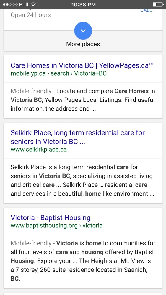
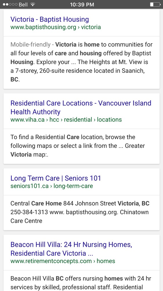
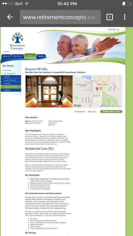
Here are the search results from my mobile device for “care homes Victoria BC”.
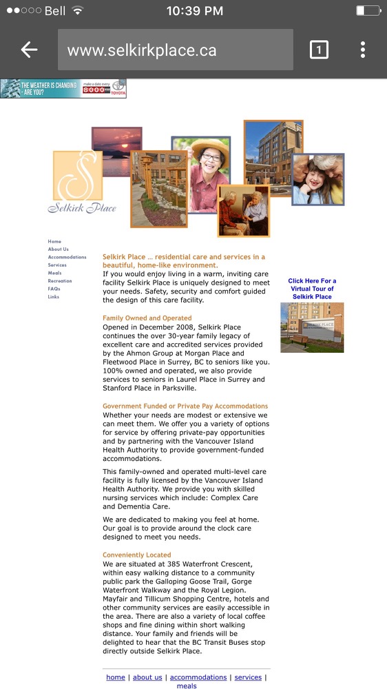
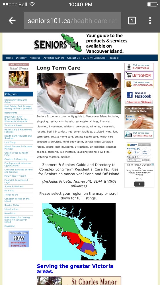
There are four search results in the top seven that aren’t mobile friendly. Here are three of those sites.
If you ask me, these sites provide a terrible mobile experience and shouldn’t be ranked where they are. I’m still in my 30’s and am having a hard time reading those sites! Nevermind their market which is mostly children with parents who are 70+ and needing a care home.
So we’ve yet to see the impact and big changes to the mobile search rankings. But that shouldn’t stop you from having a mobile friendly site.
Care more for your visitors and provide them with a great mobile experience on your site.


 Back in April Google released an update to their search algorithm. Many called it